Checkbuttons variations
ABU 23-07-2020
Some variations of the classic checkbutton widget.
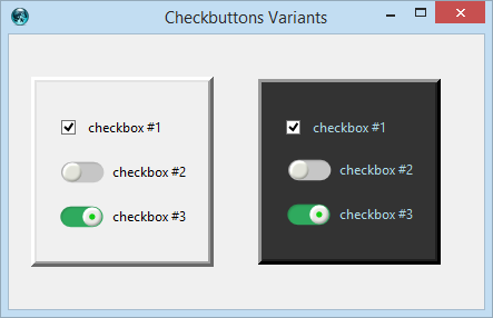 | 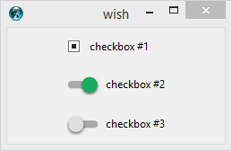 |
The following code is based on a set of small PNG images. Here is a link to a zip containing two basic images and other variations
How to use
Define a new ttk style ...
 # ---------------------------------------
 # Creating a Checkbutton variant ....
 # ---------------------------------------

set imageDir .....

image create photo toggle.off   -file [file join $imageDir toggle20off.png]
image create photo toggle.green -file [file join $imageDir toggle20green.png]


 # A new image element ; the 'active' image is green
ttk::style element create Checkbutton.Toggle.Green image {
    toggle.off selected toggle.green
}

 # define a new style using the Green checkbutton
ttk::style layout TCheckbutton.Toggle.Green {
    Checkbutton.padding -sticky nswe -children {
        Checkbutton.Toggle.Green -side left -sticky {}
        Checkbutton.label -sticky nswe
    }
}
Usage:
ttk::checkbutton .chkbox1 -text " some text" -style TCheckbutton.Toggle.Green