Small caps
if 0 {Richard Suchenwirth 2004-08-20 - "Small Caps" is a typesetting style in which each letter is set with an uppercase glyph, but the logical "lowercases" are in a smaller point size, like 60..80 % of the logical "uppercase" letters. Here's my take to implement them for Tk's text widget. You specify the widget, the position where to insert (I often use "end" there), the text itself, and optionally a font, and a smallness percentage (defaults to 67%).
I noticed that on Win95 with Tcl 8.4.5, the default font for text widgets {{MS Sans Serif]} 8} is not rendered smaller to 5 pt, even if specified. So better give an explicit font if the smallcapping doesn't seem to work...
#(1): (Couldn't you use [[:upper:]]] in place of [A-Z]? ISTR that character classes handle umlauts etc. (in a locale specific way?) - I would test in a tkcon here, but I don't actually know how to persuade my keyboard to produce an umlauted char! --MNO - RS: Oh yes, [[:upper:]]] works indeed well in my 8.4.5. I just didn't read man re_syntax too carefully... Thanks, fixed!) }
 proc smallcaps {w index text {font ""} {smallness 67}} {
    if {$font eq ""} {set font [$w cget -font]}
    set bigtag [string map {" " _ \{ _ \} _} $font]
    $w tag configure $bigtag -font $font

    set bigsize   [lindex $font 1]
    set smallsize [expr {round($bigsize*$smallness/100.)}]
    set smallfont [lreplace $font 1 1 $smallsize]
    set smalltag  [string map {" " _ \{ _ \} _} $smallfont]
    $w tag configure $smalltag -font $smallfont

    set cmd [list $w insert $index]
    #set re {([A-Z]*)([^A-Z]*)} ;# (1)
    set re {([[:upper:]]*)([^[:upper:]]*)}
    foreach {- big small} [regexp -all -inline $re $text] {
        lappend cmd $big $bigtag [string toupper $small] $smalltag
    }
    eval $cmd
 }
#-- Testing:
pack [text .t]
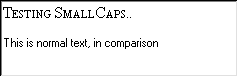
smallcaps .t end "Testing SmallCaps..\n\n" {Times 12}
.t insert end "This is normal text, in comparison"Lars H: It should probably be pointed out that the above produces what is known as fake smallcaps in typography; the problem with linearly shrinking glyphs is that they come out looking too light and too tight together. This is probably not noticable at the low resolution of a computer screen (most stems end up 1 pixel thick anyway), but it looks bad in print. Better font families have specially designed smallcaps fonts instead. (Question: How do these show up in Tk -- as a separate style or as something completely unrelated to the regular font?) The classical quote on the subject is
- Anyone who would fake smallcaps would also steal sheep.
but then again, sheep-stealing is an old and honourable tradition.
RS: This is the second time I've been accused of stealing sheep (after Letter-spacing on Additional string functions). Oh well... I'm not chasing for perfection in typography, just looking how we can do things in Tcl that others have (this example being prodded by Applescript). But thanks for pointing out the problems ahead :)
Arts and crafts of Tcl-Tk programming Category Widget Category Example