Widgets in the initial Tk package
CORE WIDGETS
These are the widgets you'll find available everywhere. These widgets comprise much of a Tk-based application.
- button (standard button widget)


LV Has someone considered finding a copy of these images and placing them on http://core.tcl.tk/ ?
- checkbutton (standard checkbox widget)


- radiobutton (radio button - a group of these can have one selected at a time)


- menubutton (one button storing a menu) slebetman A menubutton is what Windows developers call combobox. Unfortunately, on Windows, menubutton does not look like a proper combobox so users will usually be confused by the menubutton. On other operating systems like SunOS and the Mac, the menubutton is exactly what the user expects.

- label (a text string)


- labelframe (a frame wrapped in a border, with a label at the top)
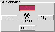
- message (a variation on the theme of labels; uncommon)


- frame (a container for other widgets, but doesn't display anything itself)
(No picture, as frames don't look very impressive. They're not meant to...)
- toplevel (a container that doesn't live inside another widget, i.e. the window itself)
(No picture, as toplevels don't look very impressive. They're not meant to...)
- panedwindow (a container for widgets that lets the user proportion space between them.)

- menu (accesses the real, OS menu on some platforms)
(A bit awkward to take a picture of this one... :^)
- scale (for adjusting numeric values)


- scrollbar (for adjusting scrollable widgets)


- listbox (selection from a list)


- entry (Single-line text entry)


- spinbox (Numeric entry widget.) MG The spinbox can also be used for non-numerical items. If you give it a list of strings, it'll scroll through them all.

- text (Multi-line text entry, with text tagging, embeddable images, and more.)


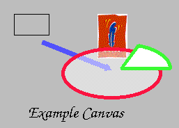
- canvas (A drawing surface for vector-based graphics, raster images, and so on.)
ADDITIONAL WIDGETS - implemented by OS on some platforms

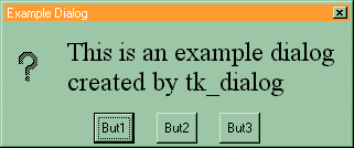
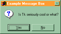
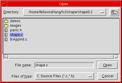
Standard Tk on Unix:
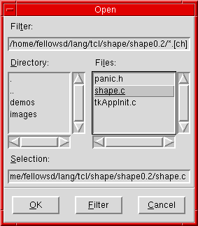
Tk on Unix in Motif-emulation mode:
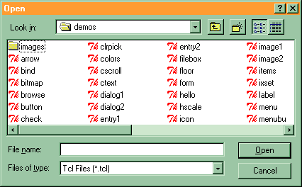
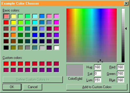
Standard Tk on Windows:
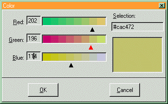
(looks very similar to the above dialogs...)

TODO - Update for 8.5, add the ttk widgets button, checkbutton, combobox, entry, frame, label, labelframe, menubutton, notebook, progressbar, radiobutton, scrollbar, separator, sizegrip, style, treeview and demo how the look differs from the default widgets.]
unnamed I also think it might be a good idea to try and create screenshots that have the best look and feel possible, which to me means a standard gray/blue color theme. The somewhat unusual color choices may lead some to believe that Tk is ugly and won't fit in. This is a good place to put our best foot forward''