Current Version: 7.9 (2020-4-12)
Available at: https://sourceforge.net/projects/tcl-awthemes/
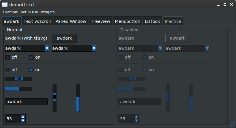
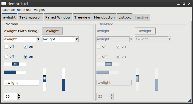
Includes: awkdark, awlight themes, Scalable awdark, awlight, winxpblue, black, breeze themes when tksvg is present.
(The pictures have been updated, it will take a some time for the wiki cache to clear them).
bll 2020-4-12: 'awthemes' started out as a couple of new themes, awdark and awlight. When tksvg came out, I created scalable versions of awdark and awlight. Helper routines are included to set menu colors, text widget colors and listbox widget colors.
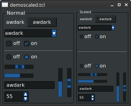
The scalability uses the base tk scaling (it doesn't scale the fonts, those should be set to points and scaled by the application), and an additional application level scaling factor can also be set. A new style with a different scaling factor can be created, including scaled widgets and graphics, used simultaneously with the main style.
Scalable versions of the 'winxpblue' and 'black' themes were added.
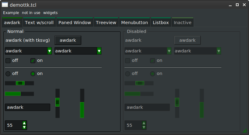
As of 2020-4-12 version 7.9, the breeze theme by Maximilian Lika has been added as a scalable theme. A couple of new helper routines to change the graphics/focus color and to change the background color have been added.
Newsbll 2020-4-12: Added a scalable breeze theme. Based on Maximilian Lika's breeze theme version 0.8 ( Breeze at github ). New helper routines to change the graphics/focus color and the background color have been added.
bll 2019-11-30: Version 7.0 splits out the theme specific data into separate files.
bll 2019-11-23: Version 6.0 adds the scalable winxpblue theme.
bll 2019-11-19: Version 5.0 features an additional scaling setting for use by the application, and the ability to create a scaled style, giving different graphics sizes for the same theme using the new style.
bll 2019-10-4: With version 4.0, support for other themes has been added. A scalable 'black' theme has been implemented.
bll 2019-10-7: With version 3.0, if tksvg is present, the graphics will scale according to the tk scaling setting.
bll 2018-9-1: Just thought I would try and create a new theme. Loosely based on adwaita dark. I have learned more about ttk themeing, found issues in my application code related to colors and themes. Uses graphics for the checkbuttons and radiobuttons. The notebook tab top color is created dynamically. Everything else is based on the clam theme.
In order to match the theme graphics size to the font size, the application can:
   tk scaling 1.3888 ; # set the tk scaling appropriate to the user's computer

   set sz1 [font metrics TkDefaultFont -ascent] ; # the default font size for Tk
   set sz2 [font metrics appfont -ascent]       ; # the application font default size
   set scale [expr {double(sz2)/double(sz1)}]   ; # calculate the scaling ratio
   package require awthemes
   ::themeutils::setThemeColors awdark \
       scale.factor $scale
package require awdark Same theme, different styles, different graphics sizes:
A new style with appropriately sized graphics can be created. For example, the application may have a base application font size used everywhere, and an alternate sized font for data listings.
The application can then:
  package require awdark
  if { [info commands ::ttk::theme::[ttk::style theme use]::scaledStyle] ne {} } {
    ::ttk::theme::[ttk::style theme use]::scaledStyle Listing mainfont listingfont
  }
Then the data listings are created using Listing.TCheckbutton, Listing.TCombobox, etc. which match the font size specified.
All of the Listing.* widgets have re-configured graphics sizes to match the specified font.
7.9 (2020-4-12)
- winxpblue: fixed minor focus color issues (entry, combobox).
- fixed incorrect scrollbar background color.
- button: added state {active focus}.
- entry: added ability to set graphics.
- notebook: added hover, disabled graphics.
- combobox: graphics will be set if entry graphics are present.
- combobox: readonly graphics will be set to button graphics if both entry and button graphics are present (breeze theme).
- menubutton: option to use button graphics for menubuttons.
- toolbutton: option to use button graphics for toolbuttons.
- 'setListBoxColors': remove borderwidth and relief settings.
- spinbox: graphics will be set if entry graphics are present.
- internal code cleanup: various theme settings have been renamed.
- added breeze theme (based on Maximilian Lika's breeze theme 0.8).
- add new helper routines to ::themeutils to set the background color and to set the focus/highlight color.
- awdark/awlight: no tksvg: Fixed some grip/slider colors.
- fix user color overrides
7.8 (2020-3-8)
- set listbox and text widget highlight color, highlight background color.
7.7 (2020-1-17)
- fix crash when tksvg not present.
- improve awdark border colors.
7.6 (2019-12-7)
- better grip design
7.5 (2019-12-4)
- reworked all .svg files.
- cleaned up notebook colors.
- fixed scaling issue with scaled style scaling.
- fixed combobox scaling.
- fixed scrollbar arrows.
- scaled combobox listbox scrollbar.
7.4 (2019-12-3)
- added hasImage routine for use by checkButtonToggle
- Fix menu highlight color
7.3 (2019-12-2)
- fix spinbox scaled styling
7.2 (2019-12-2)
- setBackground will not do anything if the background color is unchanged.
- fixed a bug with graphical buttons.
- make setbackground more robust.
7.1 (2019-12-1)
- fix border/padding scaling, needed for rounded buttons/tabs.
7.0 (2019-11-30)
- clean up .svg files to use alpha channel for disabled colors.
- calculate some disabled colors.
- fix doc.
- split out theme specific code into separate files.
- Fix scaledStyle set of treeview indicator.
- make the tab topbar a generalized option.
- merge themeutils package
- clean up notebook tabs.
- winxpblue: notebook tab graphics.
- winxpblue: disabled images.
- black: disabled cb/rb images.
- black: add labelframe color.
6.0 (2019-11-23)
- fix !focus colors
- slider border color
- various styling fixes and improvements
- separate scrollbar color
- optional scrollbar grip
- button images are now supported
- added winxpblue scalable theme
- fixed missing awdark and awlight labelframe
5.1
- add more colors to support differing spinbox and scroll arrow colors.
- awlight, awdark, black theme cleanup
- rename menubutton arrow .svg files.
- menubutton styling fixes
5.0
- rewrite so that the procedures are no longer duplicated.
- rewrite set of arrow height/width and combobox arrow height.
- Add scaledStyle procedure to add a scaled style to the theme.
- Added a user configurable scaling factor.
4.2.1
- rewrite pkgIndex.tcl
4.2
- fix scaling of images.
- adjust sizing for menu checkbutton and radiobutton.
- add support for flexmenu.
4.1
- breaking change: renamed tab.* color names to base.tab.*
- fix bugs in setBackground and setHighlight caused by the color renaming.
- fix where the hover color for check and radio buttons is set.
4.0
- add support for other clam based themes.
- breaking change: the .svg files are now loaded from the filesystem in order to support multiple themes.
- breaking change: All of the various colors and derived colors have been renamed.
- awdark/awlight: Fixed empty treeview indicator.
- added scalable 'black' theme.
3.1
- Allow user configuration of colors.
3.0
- Breaking change: The package name has been renamed so that 'package require awdark' works.
- Support for tksvg has been added. New graphics have been added to support tksvg, and the graphics will scale according to the 'tk scaling' setting. 'tk scaling' must be set prior to the package require statement.
- demottk.tcl has been updated to have scalable fonts. The 'tk scaling' factor may be specified on the command line: demottk.tcl <theme> [-scale <tk-scaling>]
2.6
- Fix mac colors
2.5
- Added missing TFrame style setup.
2.4
- Some cleanup for text field background.
2.3
- Added padding for Menu.TCheckbutton and Menu.TRadiobutton styles
2.2:
- Added support for flexmenu.
- Fixed listbox frame.
2.1:
- Added Menu.TCheckbutton and Menu.TRadiobutton styles to support menu creation.
2.0:
- Add setBackground(), setHighlight() routines. If wanted, these require the colorutils package.
- Remove the 'option add' statements and use a bind to set the combobox's listbox colors.
- Merge awdark and awlight themes into a single package.
- More color cleanup.
- Make notebook top bar use dynamic colors.
1.4: change button anchor to default to center to follow majority of themes
1.3: clean up images a little
1.2: fix button press color
1.1: per request, remove the leading :: from the package name.
1.0: More fixes for Mac OS X.
0.9: Fixes for Mac OS X.
0.8: Set disabled field background color for entry, spinbox, combobox. Set disabled border color.
0.7: Fixed listbox helper routine. Added option for dark background for the text helper routine
0.6: Fixed hover highlight on notebook tabs.
::ttk::theme::awdark::setMenuColors .menuwidget
Sets the menu colors and also changes any checkbutton and radiobutton types to use thematic images. Run this after adding all the menu items to the menu.
Side effect: The menu will have -hidemargin set to true.
If you don't want the thematic images, run it before adding your menu items (and set -hidemargin back to false).
::ttk::theme::awdark::setTextColors .textwidget ?-dark?
Sets the text widget colors. If -dark is specified, the darker background color (as for entry) will be used.
::ttk::theme::awdark::setListboxColors .listboxwidget
Sets the listbox widget colors.
Change the background color
package require awthemes
package require colorutils
::themeutils::setBackgroundColor awdark #221100
package require awdark
Change the graphics and focus color
package require awthemes
package require colorutils
::themeutils::setHighlightColor awdark #007000
package require awdark
Demonstration of scaled styles:
After:
package require awthemes
package require colorutils
::themeutils::setHighlightColor awdark #007000
package require awdark
Jeff Smith 2019-07-04 : Below is an online demo of awdark using CloudTk
Jeff Smith 2019-07-04 : Below is an online demo of awlight using CloudTk
See also: List of ttk Themes