A logo for Tcl 9
Final logo
CGM 27/9/24 - And The Winner Is...
This initiative prompted Steve Landers to consult a real graphic designer, Valerie Carroll of Carroll Graphics (valerie at carroll.graphics) who produced the logo above. Steve may have more to say about the logic behind this specific design. Thanks very much to Valerie and Steve.
Note that the feather section can be used alone as an icon:
These images can be found in various formats at https://cmacleod.me.uk/tcl/logo/ .
PO 2024-10-10 - I uploaded a ZIP file containing icon files for Windows (ICO) and Mac (ICNS) as well as PNG files of the icon and the logo in different sizes (256, 1024) and backgrounds (white, black, transparent). stevel Thanks Paul, we need to get these into the next distribution of Tcl and Tk.
stevel 28/9/24 Here's some background to the logo design.
We wanted a fresh new design that builds on the past but reflects a new beginning.
Every element of the design is quite deliberate - the feather is there but isn’t (if you see what I mean) and positioned to emphasise “scripting” rather than “lightness”. The colours were chosen to be distinct from other language icons (yes, we reviewed a lot) and also other uses of the feather (e.g. Apache). They were chosen to be complementary and not overwhelm other colours if embedded in a document, application or website. The actual color was suggested by Michael Doyle and is #BADA55. The font (Georgia) was chosen to distinguish visually from the electronics company, and the subscript 9 to allow us to evolve in future. The icon part of the logo is square so it can be used for a desktop / dock / toolbar icon. It is also simple - there are no complicated elements nor no shading so the icon can be shrunk down to a small size and used as a favicon or toolbar/menubar icon and still be recognizsable.
Many thanks to all those who have provided feedback this process including Michael Doyle, Colin Macleod, Brian Griffin, Marc Culler, Ashok Nadkarni, Jan Nijtmans, Kevin Walzer and Torsten Berg.
dbohdan 2024-09-28: stevel, could you say what the license for the Tcl 9 logo is? I thought the logo would look good in monochrome, so I have made two monochrome versions. Maybe someone will want to use them in a printout.


stevel 2024-09-29 - Same license as Tcl. The logo was designed to work in multiple media types - so monochrome will work, but so will grayscale (and will arguably be better in print). The intention is to include these in the next Tcl distribution - both scalable SVG images and raster images in colour, grayscale and monochrome at various resolutions.
CGM 2024-11-08: Here's a new-style version of the old "Tcl-Powered" logo:

Discussion
With a new version of Tcl, it could be interesting to have a new logo. This wiki page can feed discussion and thinking about it, following the thread on Tcl-core mailing list.
CGM started a poll on Mastodon at https://mastodon.scot/@CGM/112908834664981456 between two of the old versions and two new ones. This poll has now finished, my toolbox and the Hartford Design logo were roundly rejected, the feather reigns supreme, with the updated version preferred nearly 3:1 over the original.
Trends
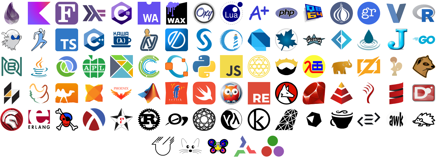
In this area, there are trends as you can see with this small collection of programming language logo at the bottom of the page.
- There is 1-letter or 2-letters logo (Fortran, Rust, Erlang, C, D, J, V, R, Javascript, Typescript, A+, Zig, SAS, Kotlin, QuickBasic).
- There is pictorial logo (Python, Ruby, OCaml, Java, Maple, Swift).
- There is wordmark (APL, Go, Php, Lua, Groovy, Erlang).
- And finaly emblem logo with different esoteric symbols.
Requirements
So the question is what are the requirements for identifying a future Tcl logo.
Unless we change the name of the language for language T ;-), we have the choice between a wordmark logo (where Tcl is really written), a pictorial logo (like the legacy feather for example) or an emblem logo. If we think that Tcl suffers from a lack of visibility, a wordmark logo could be a reasonable choice. So, people don't have to guess what this logo could be. But it's just an opinion and not the truth.
From the design point of view, the requirements for a modern logo are :
- Simple shapes & minimalistic design : easy to draw and scalable with not too thin details
- Few colors : to be easily reproducable in different support (application, web page, icon, T-shirt, sticker, patch, mug, ....)
- Distinct and recognizable : no ambiguity with other logo (As a game, try to find which lambda letter logo is Lisp, Clojure, Racket or Haskell !)
- Feel free to add other requirements if necessary
The Feather ?
CGM There was some discussion on Tcl-Core about the desirability of keeping the feather. My feeling is that its origin (from tickling with a feather) is too obscure for those not already 'in the know', and also it's too similar to the feather used by the Apache project https://apache.org/ . However some people are very attached to it. My conclusion was to incorporate it, but not as the primary focus of the design.
Hmm, perhaps we could claim an association with the ancient Egyptian "feather of truth" - https://en.wikipedia.org/wiki/Maat#/media/File:Maat.jpg ?
One of the comments on my Mastodon poll suggested just adding some text to the updated feather. So I tried this and produced

Any idea ?
Here is some draft only to feed the discussion. Other ideas are welcomed. The logo is first displayed in black&white to clearly identify the shape. Parameters that may vary are fonts, colors, colors effects and aspect ratio.

CGM I think having "TCL" in capitals invites confusion with the TCL consumer electronics company - https://en.wikipedia.org/wiki/TCL_Technology - so I would stick with the usual form "Tcl". Aside from that, I like the version with the spanner.
With Tk to avoid trademark infringement.
saito Tool command language?


CGM I like these, particularly the last one, which I think is more effective than any of my efforts!
So now I tried to recreate that one in SVG format, and added my simplified feather (but it can easily be removed if it's felt to be too silly) :
saito I am glad you liked it. I took those from an icon site but I like the version you made. Btw, the font I used is called Bank Gothic. But yeah, for me the tool aspect seems more prominent tha the feather pun.
CGM Here is another attempt in SVG format, obviously this could be tweaked in various ways:
I used to like this one but now feel it's overcomplicated:
The TclMagick code to generate this is at https://cmacleod.me.uk/tcl/logo/ so anyone who feels like it can modify colours, scaling, whatever. The components could be used separately, in particular the Tcl block section on its own would make a square icon that would work at small sizes, I think. Fans of the feather might like to take the number 9 / curled feather at the end of the image above and redraw it in a cleaner, neater form as a stand-alone icon.
Here is a feather-free blocks-only version of the image above, which seems a bit cleaner to me:
An ASCII art domino
 -------   -------   -------
| O O O | | O     | | O O O |
|   O   | | O     | |   O   |
|   O   | | O O O | |   O   |
|-------| |-------| |-------|
| O O O | |     O | | O   O |
| O     | |   O   | | O O   |
| O O O | | O     | | O   O |
 -------   -------   -------
or somewhat twisted
 ---------------   -------
| O O O | O O O | | O     |
|   O   | O     | | O     |
|   O   | O O O | | O O O |
 ---------------  |-------|  ---------------
                  |     O | | O O O | O   O |
                  |   O   | |   O   | O O   |
                  | O     | |   O   | O   O |
                   -------   ---------------
sergiol Came very late to this party, and I had the following idea:

APE what about ideas from generated logos ? There are plenty of website to generate logos from some keywords and specifications.
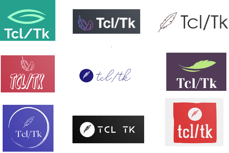
In 2017 a professional at Hartford Design made three Tcl logo designs as a favour for the Tcl community:


The first was felt to be best, but has not been used much so far.
A list of existing programing language logos coming from [L1 ] :
History
Several versions of the original feather logo  can be found at http://www.tcl-lang.org/images/logos/TclTkLogo.html .
Later the feather was redesigned at ActiveState, then an SVG reproduction of this  was created: https://commons.wikimedia.org/wiki/File:Tcl.svg .


