Creating a Q-Q plot
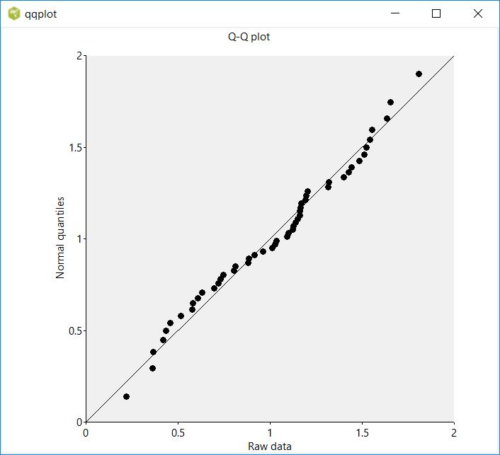
Arjen Markus (27 august 2020) Q-Q plots are a well-known graphical device for checking the statistical distribution of data sets. The idea is simple: you plot the quantiles of a given data set against the quantiles of an assumed distribution (that may be a normal distribution that is fitted to the data set or it may be a different data set) and if the two distributions are close enough, the points in the plot lie on or very near the diagonal.
The program below illustrates the procedure. It uses the statistics package from Tcllib and Plotchart from Tklib. (It also needs a procedure from the statistics that is not exported, but that should not hinder us).
The data are generated on the fly. Officially they have a triangular distribution, as they are the sum of two uniformly distributed random numbers. But with only 50 data points, they can maskerade as normally distributed. However, if you run it with, say, 500 points, the deviation from normal will become clear.
The program can easily be turned into a general procedure, but some thought will have to be given to the interface - how to deal with the canvas and especially with the probability distribution to be tested against. Well, details of course.
# qqplot.tcl --
#     Simple procedure to create a Q-Q plot
#
#     The steps:
#     - Generate some random data
#     - Determine the empirical distribution
#     - Use that as breakpoints for the normal cumulative density function
#     - Plot the random data versus the inverse of the normal CDF
#     - If the random data are distributed normally, the dots will appear on or very near the line y=x
#

package require math::statistics
package require Plotchart

pack [canvas .c -width 700 -height 600]

#
# Generate some random data - the sum of two uniformly distributed random numbers
# So definitely not normal, but we are simply illustrating the procedure
#
set data {}

for {set i 0} {$i < 50} {incr i} {
    set r [expr {rand() + rand()}]
    lappend data $r
}

#
# Estimate the parameters for a normal distribution that comes as close as possible
#
set mean  [::math::statistics::mean $data]
set stdev [::math::statistics::stdev $data]

#
# Now the empirical distribution - use the so-called plotting positions
# We simply choose the parameter "a" to be 3/8, a common choice, but many choices
# are possible
#
set sorted [lsort -increasing -real $data]

set n [llength $sorted]

set qnormal {}
set order   {}
set k       0
set a       0.375 ;# 3/8
foreach s $sorted {
    incr k
    set  q [expr {($k-$a)/($n-2.0*$a+1.0)}]
    lappend qnormal [::math::statistics::Inverse-cdf-normal $mean $stdev $q]
}

#
# Now set up the plot:
# - determine reasonable extremes
# - plot the sorted data against the normal quantiles
#
set min [lindex $sorted 0]
set max [lindex $sorted end]
set scaling [::Plotchart::determineScale $min $max]

set p [::Plotchart::createXYPlot .c $scaling $scaling]

$p dataconfig data -type symbol

foreach s $sorted q $qnormal {
    $p plot data $s $q
}

lassign $scaling min max

$p title "Q-Q plot"
$p xtext "Raw data"
$p vtext "Normal quantiles"

$p plot line $min $min
$p plot line $max $max