Interactive plotting with Plotchart
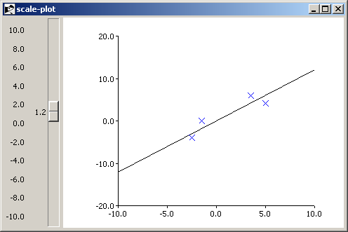
Arjen Markus (1 april 2011) When you want to illustrate a mathematical procedure, such as curve fitting, having a graph handy is quite useful. Here is a small program that allows you to change a parameter and see the immediate effect on the function. Not a major breakthrough in mathematical education perhaps, but it does show how easy it really is.
Some notes:
- This was tested with Plotchart 1.8.2, newer versions ought to make the program even simpler.
- I found a bug in Plotchart, which necessitates to insert a dummy point for the "fit" data. I will solve that in the next release.
Here is a screen-shot:
# scale-plot.tcl --
#     Demonstrate how a scale widget can interact with a plot
#
#     Note:
#     Tested with an older version of Plotchart. Hence the
#     fiddling with the tags
#

package require Plotchart

# refreshPlot --
#     Draw a new line to fit the data
#
proc refreshPlot {p value} {

    #
    # Clean up the old line
    # (Still the only tag in this version of Plotchart)
    #
    .c delete data

    $p plot fit {} {} ;# Make a clean break

    #
    # The new line
    #

    for { set i 0 } { $i < 20 } { incr i } {
        set x [expr {-10.0 * ($i-10)}]
        set y [expr {$value * $x}]

        $p plot fit $x $y
    }
}

#
# Set up the widgets
# Note:
# -from start at top
#
scale  .s -from 10 -to -10 -variable param -resolution 0.1 -tickinterval 2

canvas .c -bg white -width 400 -height 300

grid .s .c -sticky news

set p [::Plotchart::createXYPlot .c {-10 10 5} {-20 20 10}]

#
# Connect the plot to the scale widget
#

.s configure -command [list refreshPlot $p]

#
# Introduce some data
#
$p dataconfig measured -colour blue -symbol cross -type symbol

$p plot measured  3.5 6.0
$p plot measured -2.5 -4.0
$p plot measured -1.5 0.05
$p plot measured  5. 4.05

#
# Remove the tag "data" - we want to keep the measured points
#
.c dtag data data

#
# Dummy data point - error otherwise
#
$p plot fit 0.0 0.0