On the quality of (some) images on this wiki
Introductory note by uniquename 2014may21:
I have moved the following discussion from my 'Category = Person' page to this separate page because it has become way too long for that already-long personal page. This discussion was started by the comment from PYK below --- in particular the statement "the images you've been adding ... look fuzzy on my screen".
The discussion rapidly devolved into a discussion of JPEG versus PNG --- and then relative sizes of files. Unfortunately, PYK did not point out which images and what part of those images he is talking about --- even after repeated requests for specific images (and suggested images to consider) below. So I have to bow out of this 'discussion'.
Here is the start of the 'thread':
PYK 2014-03-02: Hi Blaise, I think the images you've been adding are nice improvements to the Wiki. They look fuzzy on my screen though because they are in the jpeg format. PNG is a great format for screenshots because it preserves the crispness of lines. I've had good results in making .png files of screenshots even smaller than typical .jpg files by decreasing the color depth, and wanted to suggest the low-color-depth .png files would look even better on wiki pages.
---
uniquename 2014mar09 : Hi PYK. If you are referring to pictures like the plot image just above, it is blurry because it is a reduction of the full-size image. Click on the 'number-link' just below that image to see the full-size image. I think you will see it is much clearer.
Apparently digital camera manufacturers do not share your preference for PNG over JPEG. All those manufacturers capture photos in JPEG format not PNG.
One place you see PNG a lot is on Wikipedia --- in cases where they have provided several different sized images of SVG (scalable vector graphics) files. Since those kinds of images (SVG) generally have a relatively small color palette --- perhaps larger than 256 colors but much smaller than 16 million --- there is a case were PNG is probably at least as good as JPEG.
But for photos, which can literally have over a million shades of different colors, professional photographers (and digital camera manufacturers) have chosen to stay with the JPEG format.
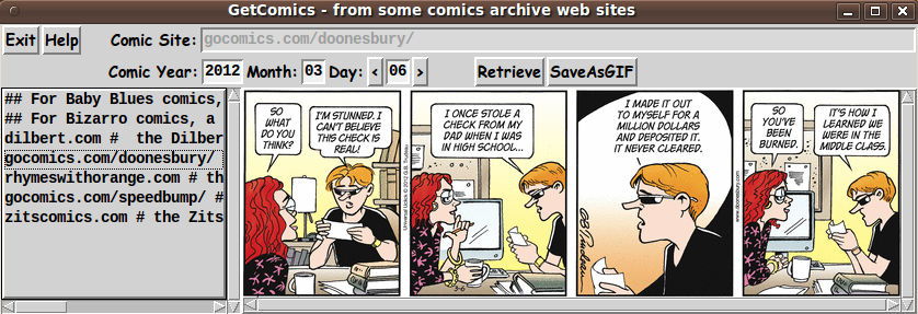
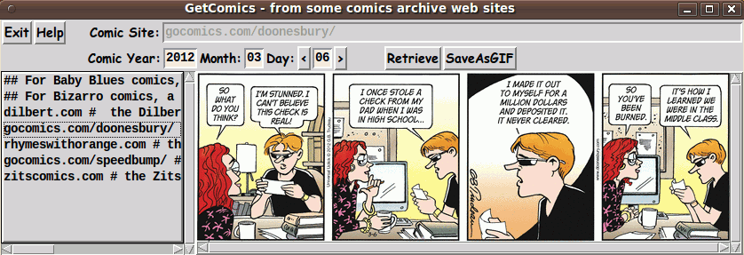
Check out the screen captures (in JPEG) format on the tkGetComics - to get 'old' comics from comic archive web-sites page that I added recently. If those images look blurry to you, there is something wrong with your computer or your eyes. The 3 JPEG screenshots there look quite clear to me, using my computer and LCD monitor.
If you are using an LCD monitor, there may be some settings that you need to fine-tune. On my Ubuntu 9.10 system (using the Gnome 2.28 desktop environment), there is a utility available via 'System > Preferences > Appearance > Fonts' that allows you to fine-tune various LCD monitor parameters.
---
RLE (2014-03-14): In general PYK is correct in his statements regarding utilizing PNG for screenshots. JPEG is optimized for continuous tone images (i.e., real world photographs) which is why digital cameras output JPEG images. But for screen captures, which are not continuous tone images, the sharp contrast changes between the differently colored lines/elements in the image cause the JPEG compression algorithm to produce some output noise in the resulting compressed image. It exhibits typically as a ringing or halo around sharp line edges. This noise is a direct result of how the JPEG compression removes high frequency image components in order to compress the image. PNG's compress the input image data using a lossless compression system, so there is no compression noise introduced into a PNG. This is what makes PNG the better choice for screen shots. The decompressed image is identical to the input image.
---
uniquename 2014mar16
RLE, That may be your experience with your process, but that is not what I am seeing with mine. I do my screen captures of the GUI windows with 'gnome-screenshot', which by default makes PNG files. I usually crop the capture and sometimes do some other processing (like blurring out a name in an entry field) with the 'mtpaint' image editor. Then I use the ImageMagick 'convert' command to make a JPEG from the PNG file --- at high-quality (near lossless) by using the '-quality 100' parameter with the 'convert' command.
I use a script that makes the JPEG file in the same directory with the PNG file, with the same filename except for the suffix '.jpg' instead of '.png'. Then the script shows the '.jpg' with the 'eog' (Eye of Gnome) image viewer. That image viewer allows me to quickly switch back and forth between the '.jpg' file and the '.png' file. They always look identical to me --- while the '.jpg' is typically one-third to one-sixth the size of the '.png' (or smaller). I put the '.jpg' on the wiki since it is much smaller.
Note that if what you say is (always) true (even when using 'convert' with '-quality 100'), then I should be seeing a definite difference between the '.jpg' file and the '.png' file.
I have to wonder if the fuzziness that PYK is talking about is mainly in the fonts (the text) --- and not in 'photo' images put on a Tk canvas. Some people do not like the way some systems do anti-aliasing of fonts. They prefer their fonts without anti-aliasing. I have used the LCD monitor fine-tuning that I mentioned above to make the anti-aliased fonts on my system look quite acceptable to me. (Also I am probably not as sensitive to some fuzziness in fonts as some people are.)
PYK should take a look at my page tkPlayMediaFilesInPlaylist - a front-end for multiple media-players where I have posted 3 screenshots of the GUI, with 3 different fonts --- 'Comic Sans', 'Times New Roman', and 'Zachary'. I suspect that PYK would say he prefers the 'Times New Roman' --- because it looks 'crisper'. The 'hinting' or 'anti-aliasing' of the other two fonts may be making them look a little fuzzy --- as generated by a Linux version of the 'wish' interpreter, using the underlying anti-aliasing system.
By the way, as I mentioned above, Wikipedia uses PNG to render multiple sizes of SVG files --- BUT I do not see Wikipedia converting their many thousands of JPEG files to PNG files.
When digital camera manufacturers and professional photographers and Wikipedia switch from JPEG to PNG, then it becomes convincing that PNG is the way to go.
Note that professional photographers convert their RAW format to JPEG, not PNG. They must find, like I do, that when 'near-lossless' compression is done, the results are more than satisfactory.
---
RLE (2013-03-17): Just because you can't visually discern the loss, does not mean it has not happened. It just means that it is not visually perceptible. Which is why JPEG works so well on continuous tone photographs. For those inputs, the loss is usually not visually perceptible to most viewers.
The reason you are not seeing much loss is that you are using -quality 100. That setting is the closest you can choose for "lossless jpeg" with JPEG. (Note the quote from the man cjpeg page below. There is still some small loss even with -quality 100.)
Have you ever tried converting any of your screenshots into 256 color PNG's. Gnome-screenshot is likely outputting 32-bit (or maybe 24-bit) PNG's. I've often found that color quantizing a screen shot down to 256 colors produces a significantly smaller PNG output file than trying to apply high quality JPEG compression to a 24bit (or 32bit) JPEG file.
Professional photographers keep their RAW snaps archived for a reason. There is no loss. They produce JPEG for distribution for two reasons:
- most users have no ability to view RAW images (every camera maker has a different RAW format);
- RAW images are much too large for general use/viewing.
But professional photographers are also taking continuous tone photographs. Exactly the type of source image that JPEG was specifically designed and optimized to compress.
JPEG compression/images are a tool. A tool optimized for best performance with photographs.
PNG compression/images are also a tool. A tool that is optimized for computer bitmaps with high contrast edges (well, not really why it was designed, it is optimized for lossless image compression).
The tools serve complementary, but different segments and purposes. Just as you can, but generally should not, use a hammer to drive in a screw, you should also use the right image compression tool for the job. For computer screen shots (that don't include real world photographs in the shots) JPEG is not the correct tool. It will work, and most of the time it will be more than acceptable. But that does not change the fact that it is still not the correct tool for that job.
Since you are using gnome-screenshot, that implies you are using Linux. Here is a test you can do for yourself. For whatever distribution you are using, do this:
- Install the GIMP (http://www.gimp.org/ ).
- Take a gnome-screenshot of a GUI window.
- Convert the output into a JPEG using your script.
- Start the GIMP.
- Open both the original screen shot and your JPEG converted file (this will produce two GIMP image windows),
- In one of the GIMP image windows pick the Edit->Copy command from the menu.
- In the other GIMP image window, pick the Edit->Paste As->New Layer command from the menu.
- Now close the other image window (where you did the Copy).
- Now, find the "layers pallete" there should be an entry labeled "Mode: ..." with a dropdown to select several options, pick the "difference" option.
- The view of your image should now change to view where you see the differences between the two images. Anything that is not black is a change between the PNG original and the JPEG result.
Note: support from additional sources for my facts below:
- http://en.wikipedia.org/wiki/Jpeg#Typical_usage
- "The JPEG compression algorithm is at its best on photographs and paintings of realistic scenes with smooth variations of tone and color. ... On the other hand, JPEG may not be as well suited for line drawings and other textual or iconic graphics, where the sharp contrasts between adjacent pixels can cause noticeable artifacts. Such images may be better saved in a lossless graphics format such as TIFF, GIF, PNG, or a raw image format. The JPEG standard actually includes a lossless coding mode, but that mode is not supported in most products."
- man cjpeg
- "The -quality switch lets you trade off compressed file size against quality of the reconstructed image: the higher the quality setting, the larger the JPEG file, and the closer the output image will be to the original input. Normally you want to use the lowest quality setting (smallest file) that decompresses into something visually indistinguishable from the original image.
- -quality 100 will generate a quantization table of all 1's, minimizing loss in the quantization step (but there is still information loss in subsampling, as well as roundoff error). This setting is mainly of interest for experimental purposes. Quality values above about 95 are not recommended for normal use; the compressed file size goes up dramatically for hardly any gain in output image quality.
Some examples of JPEG compression artifacts: http://en.wikipedia.org/wiki/Jpeg#Compression_ratio_and_artifacts
- http://www.faqs.org/faqs/jpeg-faq/part1/
- [Note, much of the JPEG FAQ was written before PNG, when GIF was what PNG is today, that is the reason the quotes below all refer to GIF]: JPEG is "lossy," meaning that the decompressed image isn't quite the same as the one you started with. (There are lossless image compression algorithms, but JPEG achieves much greater compression than is possible with lossless methods.) JPEG is designed to exploit known limitations of the human eye, notably the fact that small color changes are perceived less accurately than small changes in brightness. Thus, JPEG is intended for compressing images that will be looked at by humans. If you plan to machine-analyze your images, the small errors introduced by JPEG may be a problem for you, even if they are invisible to the eye.
- JPEG has a hard time with very sharp edges: a row of pure-black pixels adjacent to a row of pure-white pixels, for example. Sharp edges tend to come out blurred unless you use a very high quality setting. Edges this sharp are rare in scanned photographs, but are fairly common in GIF files: consider borders, overlaid text, etc. The blurriness is particularly objectionable with text that's only a few pixels high. If you have a GIF with a lot of small-size overlaid text, don't JPEG it.
A brief technical overview of JPEG can be found in section [75] of the comp.compression FAQ located here http://www.faqs.org/faqs/compression-faq/part2/
This page has a javascript applet where you can use a slider to select different quantization parameters and immediately see the results: http://www.visengi.com/products/jpeg_hardware_encoder
Note that the image is a photograph, so the quality slider has to be dropped quite a lot before noticeable artifacts start to become visible.
---
uniquename 2014mar21 RLE, your very first sentence above claims I am saying something that I definitely did not say:
"Just because you can't visually discern the loss, does not mean it has not happened."
I did NOT say that it was lossless. In fact, I said it was "near lossless" (under the right conditions) --- in multiple places. Please do not keep ascribing to me things that I did not say.
In any case, you just made my point for me --- "can't visually discern the loss".
Let us not forget what kicked off this 'discussion' --- PYK's comment "They look fuzzy on my screen".
If PYK (or you) can pick out several images that I have captured and point out specific places on those images where you think the image is 'too fuzzy', then maybe we can get someplace, instead of piling words upon words.
I have suggested images on two pages already:
tkGetComics - to get 'old' comics from comic archive web-sites
and
tkPlayMediaFilesInPlaylist - a front-end for multiple media-players
If PYK (or you) have issue with screen captures that I did of windows I made from other people's Tk scripts, how about looking at
and
Tell me a specific area on the images that is 'grating on your sensibilities'.
(This discussion should be moved to another page --- or deleted. This is junking up a page that is categorized as a 'Person' page --- not a 'JPEG' page.)
(By the way, where is a list of wiki 'Categories'? --- so that 'contributors' can know the categories that they should --- and should not --- be using. The wikignomes page encourages using categories, but how are we supposed to know what are valid categories? Any word we want to use? Is 'Pussy Riot' OK?)
INSERT by EMJ 2014-03-21: Click on "Category Person" at the bottom of this page, then click on "Category Category" on the bottom of that page, then click on the page title (but also read it to see how they work). You could create a category if you wanted, I wouldn't create "Pussy Riot" if I were you, one gnome or another would probably remove it anyway!)
---
uniquename 2014may21: I just recently saw your 'insert', EMJ. I have been avoiding this discussion for a couple of months while I try to get some scripts (like wheeeMorph - to morph 2 images - GIF/PNG/JPEG/other - using a barymetric technique on triangles) done. It is a waste of my time to respond to RLE, who is continuing to ascribe statements and beliefs to me that I have not made and do not hold.
I fully expected a 'wikignome' to remove the 'P. Riot' reference. For those who do not know, that is the name of a Russian girl band that was in the news in early 2014 after being imprisoned for a while by Putin's government. It has been surprising to me that the various news outlets (CNN etc.) have not been bleeping their name --- nor was it bleeped as they were introduced on various interview shows such as the Colbert Report and others. If anyone is offended, they are welcome to remove it --- or replace it with 'crap', which seems to be quite acceptable on the 'Everyone Loves Raymond' show.
EJM, thanks for the reference to the Category Category page. I actually got to it via your EMJ page. The reference at the bottom of the 'Category Category' page --- How do Wiki Categories work --- gives a nice categories list, in one place. I can see at least 10 categories that I will probably use in the future.
(Continued)
(Another 'by the way': What does 'RLE' stand for? The RLE page does not say. I know who 'major' contributors like KPV and RS and MBS and GS and DKF and DPE and BHE and AMG and AM and KBK and JH and BBW and JO are --- by their deeds and by their first and last names. But who is this RLE? And who is 'Poor Yorick' PYK? Trolls or Wikignomes --- that is the question.)
RLE (2014-03-21) You are welcome to move this discussion to a new page (or wrap it in a <<discussion>> tag pair).
So, lets review how this discussion began:
- PYK
- ... They look fuzzy on my screen though because they are in the jpeg format. PNG is a great format for screenshots because it preserves the crispness of lines. ...
The first half of sentence #1 is subjective. To PYK they must look fuzzy, or else he would not have said anything. The second half of the statement is 100% factual. JPEG does not preserve, with 100% fidelity, straight edge lines. The third sentence is also 100% factual, PNG preserves the exact image, because it uses loss-less compression.
So, your response:
- ... Apparently digital camera manufacturers do not share your preference for PNG over JPEG. All those manufacturers capture photos in JPEG format not PNG. ...
#1 - an irrelevant aside. Camera's are not capturing computer screen shots, so what format camera makers utilize is not relevant to the capturing of computer screen shots.
- ... But for photos, which can literally have over a million shades of different colors, professional photographers (and digital camera manufacturers) have chosen to stay with the JPEG format. ...
#2 - the same irrelevant aside. You are not posting photographs. You are posting screen shots. The proper tool optimized for a photograph is not always the proper tool for a screen shot.
- ... Check out the screen captures (in JPEG) format on the tkGetComics - to get 'old' comics from comic archive web-sites page that I added recently. If those images look blurry to you, there is something wrong with your computer or your eyes. ...
#3 - a thinly veiled attack on PYK, stating that there "IS" something wrong with his monitor or eyes when you are uploading images compressed with an algorithm known to create fuzziness for screen capture format images.
Two completely wrong statements, and a thin attack. You don't exactly have the high-road here yourself.
As to your size arguments, I just performed a quick test. I pulled off the image you uploaded to the wiki here: https://wiki.tcl-lang.org/_/image?N=38347 . It is the help screen for the Morley's Miracle code example. I first converted the jpg downloaded from the wiki to a png, then optimized the png with optipng. Additionally, I loaded the png that resulted from JPEG conversion into GIMP, converted it to 256 colors with an optimal pallette, and saved it from GIMP and ran that save through optipng. Below are the results:
 188 -rw-r--r-- 1 rellis  192386 Mar 21 07:54 image.01.jpg
  64 -rw-r--r-- 1 rellis   64444 Mar 21 07:55 image.02.png
  64 -rw-r--r-- 1 rellis   64360 Mar 21 07:55 image.03.opt.png
  24 -rw-r--r-- 1 rellis   23277 Mar 21 07:57 image.04.256color.png
  24 -rw-r--r-- 1 rellis   23253 Mar 21 07:57 image.05.256color.opt.png
The number mapping is:
 01 - jpeg downloaded from wiki
 02 - jpeg to png conversion
      (jpegtopnm image.01.jpg | pnmtopng -compress 9 > image.02.png)
 03 - result after applying [optipng]
      (cp image.02.png image.03.opt.png ; optipng -o9 image.03.opt.png)
 04 - result after loading into GIMP, converting to 256 colors, and
      saving from GIMP
 05 - result after applying [optipng] to [GIMP] output
      (cp image.04.256color.png image.05.256color.opt.png ;
       optipng -o9 image.05.256color.opt.png)
Now, I don't have access to your original PNG from gnome-screenshot, so all I can do is present the values above based upon downloading one of your JPEG files. But for this one example, the PNG 33% of the jpg (02 vs 01) or 12% of the jpg (04 vs 01). So at least for this one example image, it would appear that not only would PNG have preserved exactly the pixels present on your screen, but it would have been 1/3th to 1/8th of the size of the JPEG.
As per your loss-less argument, lets review:
- ... That image viewer allows me to quickly switch back and forth between the '.jpg' file and the '.png' file. They always look identical to me ... Note that if what you say is (always) true (even when using 'convert' with '-quality 100'), then I should be seeing a definite difference between the '.jpg' file and the '.png' file.
Yes, you didn't say they were "loss-less". Any more than I said you said they were loss-less. You said (summarizing) "I can't see any difference". To which my response of "Just because you can't visually discern the loss, does not mean it has not happened." is a properly valid response. I.e., yes, you can't see the loss, but mabye PYK's setup is such that he can, indeed, visually perceive the loss.
If you want a couple examples, the lettering in the Doonesbury comic on your comics downloader page looks slightly fuzzy to me. (The lettering in the comic, not your surrounding GUI). That, however, is likely a representation of the quality of the original comic image itself rather than your screen shot of the comic.
The fonts in this image also look slightly fuzzy: https://wiki.tcl-lang.org/_/image?N=39477
And the font in the title bar on the help window for Morley's Miracle (the image I used in my size tests above) looks ever so slightly fuzzy.
Are any of them blurry/bad to the point of being unusable or 'grating on my sensibilities' from my viewpoint, no. They all look reasonably acceptable to me on my monitor, even though I can perceive a bit of fuzziness. At the same time, neither of us are looking at PYK's monitor, so neither of us know what is appearing for PYK. Maybe he has a setup with a very large format monitor such that the images end up magnified when displayed on his screen. Magnifying JPEG compressed images will also magnify the inherent fuzziness that the JPEG algorithm creates when asked to compress screen shots. That would make any JPEG compression artifacts much more noticeable to him than to either of us. Which would allow PYK to argue that maybe the fuzziness he perceives is the result of the JPEG compression. Using PNG, properly compressed (see example above) would mean that if PYK continues to see blurriness that it is clearly something at his end, and not the result of applying the wrong image compression algorithm.
Additionally, assuming my example above with image.01.jpg holds for your other screen shots, you could save an additional 2/3 or 7/8 worth of space by uploading properly compressed PNG images. So if space is your concern, PNG would appear based upon the test above to be the clear winner.
You can get a list of wiki categories by searching for "category category" in the text search box, then clicking the title link to pull up the page of "what links here".
Does it really matter who RLE is? If you must know, RLE are the initials of Rich Ellis.
---
Some more JPEG vs. PNG image size comparisons for you:
The key below is the same as above:
 01 - jpeg downloaded from wiki
 02 - jpeg to png conversion
      (jpegtopnm image.01.jpg | pnmtopng -compress 9 > image.02.png)
 03 - result after applying [optipng]
      (cp image.02.png image.03.opt.png ; optipng -o9 image.03.opt.png)
 04 - result after loading into GIMP, converting to 256 colors, and
      saving from GIMP (generate optimal pallete, no color dither, PNG compression 9 during save)
 05 - result after applying [optipng] to [GIMP] output
      (cp image.04.png image.05.png ;
       optipng -o9 image.05.png)
1) The image here: https://wiki.tcl-lang.org/_/image?N=39488 (comics)
  332 -rw-r--r-- 1 rellis  336425 Mar 21 10:50 image.01.jpg
  196 -rw-r--r-- 1 rellis  198399 Mar 21 10:53 image.02.png
  196 -rw-r--r-- 1 rellis  198111 Mar 21 10:53 image.03.png
   72 -rw-r--r-- 1 rellis   72251 Mar 21 10:55 image.04.png
   72 -rw-r--r-- 1 rellis   72155 Mar 21 10:55 image.05.png
2) The image here: https://wiki.tcl-lang.org/_/image?N=39490 (comics)
 400 -rw-r--r-- 1 rellis  408785 Mar 21 10:59 image.01.jpg
 252 -rw-r--r-- 1 rellis  255419 Mar 21 11:00 image.02.png
 252 -rw-r--r-- 1 rellis  255047 Mar 21 11:00 image.03.png
  92 -rw-r--r-- 1 rellis   91044 Mar 21 11:01 image.04.png
  92 -rw-r--r-- 1 rellis   90924 Mar 21 11:01 image.05.png
3) The image here: https://wiki.tcl-lang.org/_/image?N=39478 (your media GUI)
 148 -rw-r--r-- 1 rellis  149783 Mar 21 11:03 image.01.jpg
  60 -rw-r--r-- 1 rellis   57490 Mar 21 11:03 image.02.png
  60 -rw-r--r-- 1 rellis   57394 Mar 21 11:03 image.03.png
  20 -rw-r--r-- 1 rellis   17914 Mar 21 11:04 image.04.png
  20 -rw-r--r-- 1 rellis   17890 Mar 21 11:04 image.05.png
4) The image here: https://wiki.tcl-lang.org/_/image?N=38363 (15 puzzle)
 48 -rw-r--r-- 1 rellis  48711 Mar 21 11:05 image.01.jpg
 16 -rw-r--r-- 1 rellis  15764 Mar 21 11:05 image.02.png
 16 -rw-r--r-- 1 rellis  15751 Mar 21 11:05 image.03.png
  8 -rw-r--r-- 1 rellis   6567 Mar 21 11:06 image.04.png
  8 -rw-r--r-- 1 rellis   6567 Mar 21 11:06 image.05.png
That is five out of five where all of the PNG's that I've created from your JPEG's have been smaller than your JPEG's.
PYK 2014-05-21: Oops , I missed this entire conversation until just now . All Blaise's uploaded images render a bit fuzzy in my browser (Firefox) , and I assumed it was because they were jpeg images . tkGetComics - to get 'old' comics from comic archive web-sites indeed looks fuzzy in my browser , and turns out that the browser is resizing them all a little bit . I'm guessing it has something to do with the CSS for the site , but I haven't nailed it down yet . Even if the rendering had not produced any blur , I would have made the same suggestion because PNG is a better format for this type of image job . Even the images containing cartoon scans worked out well in PNG . I converted one of your images to 256-color PNG using xnview , and uploaded it for comparison . In spite of paying less attention than RLE to the conversion process , I somehow got an even better size reduction (58KB) . Apart from the background gradient , where there is more banding in the PNG version , quality is similar , but the PNG version is 6 times smaller :
uniquename 2014jul01
PYK, I was wondering why you were seeing fuzzy images. Within a week after you reported that to me, I got on my wife's computer (different monitor, different graphics card, different graphics driver, different operating system) and I looked at the images that I put on this wiki. They looked just as clear as on my computer's monitor. So I was puzzled about what is going on at your computer.
Is your Firefox browser 'tunneling' through some Google server, and is Google reducing web pages and surrounding the pages with tons of ads???
Anyway, I am here to report good news. I have done some experimenting with that comic image above --- creating GIF's, JPEG's, and PNG's. I have to go on vacation now so I will report back here with some size results and good techniques for getting small image sizes in all 3 of these formats.
Briefly, I have found that I can read the 328KB '.jpg' image above and create PNG files around the size you got with 'xnview' (and as good as RLE got) --- about 60KB to 90KB.
I am using ImageMagick 'convert' with '-colors 256' (and 128, and 64 and 32 and 16 and 8) to make the PNG and GIF files. I find it crucial to use the '+dither' command BEFORE the '-color' parameter, to turn off dithering. (I hate those speckles. Dithering is a hold-over from more than 15 years ago, when we were dealing with 2 and 8 and 16 color monitors.) Pretty amazingly, I can get nice dither-free results at the 16 and 8 color level (but somewhat less colorful than the original). More later.
PYK 2014-07-03: Great! I've played around with +dither and various color depths as well. Results, of course, depend heavily on the characteristics of the original image. One of my unfinished projects is a scripted interface to Image Magick. I intend to eventually discover and post here the explanation for fuzzy rendering in my Firefox browser, but other higher priorities are occupying me for now.