Some more Plotchart examples
Arjen Markus (5 july 2011) Working on the next version of Plotchart (together with Torsten Berg) I created two more examples of plots/charts.
Version 2.0 is work in progress. The major thing at the moment is dealing with the masks that I use to clip the graphical objects. The -box and -axesbox options are powerful tools to lay out the plots, but they also complicate the region outside the "plotarea".
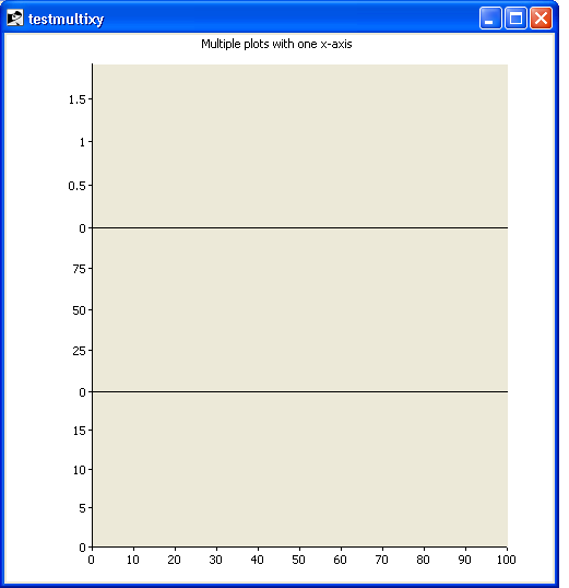
Stacked plots
The first one shows how to stack plots vertically using the same x-axis. Besides the use of the -box and -axesbox options, note the little trick that suppresses the axis label at the top: the maximum value is slightly smaller than a multiple of the stepsize.
Here is the code for this example:
# testmultixy.tcl --
#     Demonstrate how to plot a number of XY-plots above
#     each other with a common x-axis
#
#     Note that the upper limit for the axis is slightly
#     smaller than a full multiple of the step!
#
source plotchart.tcl
package require Plotchart

pack [canvas .c -width 500 -height 500]

set p1 [::Plotchart::createXYPlot .c {0.0 100.0 10.0} {0.0 19.9  5.0} -box {0 300 500 200}]

set plotarea [$p1 plotarea]
set width    [lindex $plotarea 4]

set p2 [::Plotchart::createXYPlot .c {0.0 100.0 ""}   {0.0 99.9 25.0} -axesbox [list $p1 nw 0 150 $width 150] -xlabels {}]
set p3 [::Plotchart::createXYPlot .c {0.0 100.0 ""}   {0.0  1.9  0.5} -axesbox [list $p2 nw 0 150 $width 150] -xlabels {}]

$p1 title "Multiple plots with one x-axis"
And the picture:
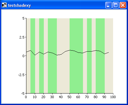
Shading to emphasize features
The second example illustrates the object subcommand. It adds a filled rectangle for the stretches of the curve where it descends.
Here is the code:
# testshadexy.tcl --
#     Demonstrate how to mark data with a shaded background
#
#     TODO:
#     Command to get the (extreme) axis values from a plot
#
source plotchart.tcl
package require Plotchart

pack [canvas .c -width 400 -height 300]

set p [::Plotchart::createXYPlot .c {0.0 100.0 10.0} {-5.0 5.0 2.5}]

set x      0.0
set y      0.0
set xbegin {}
set ybegin {}
set dx     5.0

set xold $x
set yold $y

while { $x < 100.0 } {

    set y [expr {0.7 * $y + rand() - 0.5 }]

    $p plot data $x $y

    #
    # Mark the areas where y decreases
    #
    if { $y < $yold && $xbegin == {} } {
        set xbegin $xold
        set ybegin $yold
    }

    if { $y > $yold && $xbegin != {} } {
        $p object rectangle "shade" $xbegin -5.0 $xold 5.0 -tag shade -fill lightgreen -outline lightgreen
        set xbegin {}
    }

    set xold $x
    set yold $y

    set x [expr {$x + $dx}]
}

#
# Do not forget the last one
#
if { $y > $yold && $xbegin != {} } {
    $p object rectangle "shade" $xbegin -5.0 $xold 5.0 -tag shade -fill lightgreen -outline lightgreen
    set xbegin {}
}

.c lower shade
And this is the result:
Thanx Arjen, just what the doc ordered ;-) nb