toolbar
Toolbar is a pretty common term. So the reader should not be surprised if they find various ways of creating such a thing.
CL adds that it's not just a common term; it's also the kind of construction Tk (among other toolkits) makes easy, so it's been implemented over and over (and over. and over). As Victor Wagner once posted, "just ... pack (or grid) some buttons into frame, bind <Enter> and <Leave> items to change images. I doubt that making this a package would be simpler, than hacking it on the spot with core Tk commands."
For instance, Iwidgets has a toolbar command:

Docs can be found at http://incrtcl.sourceforge.net/iwidgets/iwidgets/toolbar.html and http://purl.org/tcl/home/man/iwidgets3.0/toolbar.n.html
http://www.iit.demokritos.gr/~petasis/Tcl/toolbar.tcl provides dockable toolbars. See also ClassyTk (and mkImagesPane for code that could be used to create a toolbar).
Bwidget has a MainFrame widget, which includes a toolbar created as a ButtonBox (a series of Bwidget buttons).
MG is playing around with a Customizable Toolbar Widget on Dec 21 2005.
xf implements a toolbar.
By jesperj (12 may 2010):
There is a button style for making toolbars in ttk, simply named "Toolbutton", which provides a button which has flat appearance when in normal state, and raised when mouse is over the button, similar to for example gtk toolbars.
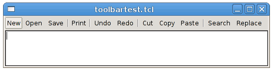
Example 1
toolbartest.tcl:
package require Tk

# Try to change the theme to see how it affects the look of the "Toolbutton" style.
# For example try "alt" and "clam"

ttk::style theme use clam

ttk::frame  .box

ttk::button .box.tbutton1 -text "New"      -command {} -style "Toolbutton"
ttk::button .box.tbutton2 -text "Open"     -command {} -style "Toolbutton"
ttk::button .box.tbutton3 -text "Save"     -command {} -style "Toolbutton"
ttk::separator .box.separator1 -orient vertical
ttk::button .box.tbutton4 -text "Print"    -command {} -style "Toolbutton"
ttk::separator .box.separator2 -orient vertical
ttk::button .box.tbutton5 -text "Undo"     -command {} -style "Toolbutton"
ttk::button .box.tbutton6 -text "Redo"     -command {} -style "Toolbutton"
ttk::separator .box.separator3 -orient vertical
ttk::button .box.tbutton7 -text "Cut"      -command {} -style "Toolbutton"
ttk::button .box.tbutton8 -text "Copy"     -command {} -style "Toolbutton"
ttk::button .box.tbutton9 -text "Paste"    -command {} -style "Toolbutton"
ttk::separator .box.separator4 -orient vertical
ttk::button .box.tbutton10 -text "Search"  -command {} -style "Toolbutton"
ttk::button .box.tbutton11 -text "Replace" -command {} -style "Toolbutton"
ttk::label  .box.tfill

text .box.textarea

grid .box.tbutton1   -row 0 -column 0  -pady 3 -padx 0
grid .box.tbutton2   -row 0 -column 1  -pady 3 -padx 2
grid .box.tbutton3   -row 0 -column 2  -pady 3 -padx 2
grid .box.separator1 -row 0 -column 3  -pady 7 -padx 2 -sticky news
grid .box.tbutton4   -row 0 -column 4  -pady 3 -padx 0
grid .box.separator2 -row 0 -column 5  -pady 7 -padx 2 -sticky news
grid .box.tbutton5   -row 0 -column 6  -pady 3 -padx 2
grid .box.tbutton6   -row 0 -column 7  -pady 3 -padx 2
grid .box.separator3 -row 0 -column 8  -pady 7 -padx 2 -sticky news
grid .box.tbutton7   -row 0 -column 9  -pady 3 -padx 2
grid .box.tbutton8   -row 0 -column 10 -pady 3 -padx 2
grid .box.tbutton9   -row 0 -column 11 -pady 3 -padx 2
grid .box.separator4 -row 0 -column 12 -pady 7 -padx 2 -sticky news
grid .box.tbutton10  -row 0 -column 13 -pady 3 -padx 2
grid .box.tbutton11  -row 0 -column 14 -pady 3 -padx 2
grid .box.tfill      -row 0 -column 15 -pady 3 -padx 0 -sticky ew
grid .box.textarea   -row 1 -column 0 -sticky ewns  -columnspan 20
grid .box -sticky news

grid columnconfigure .box 15 -weight 1
grid rowconfigure    .box 1  -weight 1
grid columnconfigure .    0  -weight 1
grid rowconfigure    .    0  -weight 1
Screenshot:
Example 2
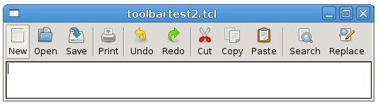
This toolbar example uses the tango icons available from http://tango.freedesktop.org/Tango_Icon_Library
toolbartest2.tcl:
package require Tk

# Needed for .png image support.
package require Img

# Try to change the theme to see how it affects the look of the "Toolbutton" style.
# For example try "alt" and "clam"

ttk::style theme use clam

image create photo icon_new     -file  tango-icon-theme-0.8.90/22x22/actions/document-new.png
image create photo icon_open    -file  tango-icon-theme-0.8.90/22x22/actions/document-open.png
image create photo icon_save    -file  tango-icon-theme-0.8.90/22x22/actions/document-save.png
image create photo icon_print   -file  tango-icon-theme-0.8.90/22x22/actions/document-print.png
image create photo icon_undo    -file  tango-icon-theme-0.8.90/22x22/actions/edit-undo.png
image create photo icon_redo    -file  tango-icon-theme-0.8.90/22x22/actions/edit-redo.png
image create photo icon_cut     -file  tango-icon-theme-0.8.90/22x22/actions/edit-cut.png
image create photo icon_copy    -file  tango-icon-theme-0.8.90/22x22/actions/edit-copy.png
image create photo icon_paste   -file  tango-icon-theme-0.8.90/22x22/actions/edit-paste.png
image create photo icon_search  -file  tango-icon-theme-0.8.90/22x22/actions/edit-find.png
image create photo icon_replace -file  tango-icon-theme-0.8.90/22x22/actions/edit-find-replace.png

ttk::frame  .box

ttk::button .box.tbutton1 -text "New"      -command {} -style "Toolbutton" -compound top -image icon_new
ttk::button .box.tbutton2 -text "Open"     -command {} -style "Toolbutton" -compound top -image icon_open
ttk::button .box.tbutton3 -text "Save"     -command {} -style "Toolbutton" -compound top -image icon_save
ttk::separator .box.separator1 -orient vertical
ttk::button .box.tbutton4 -text "Print"    -command {} -style "Toolbutton" -compound top -image icon_print
ttk::separator .box.separator2 -orient vertical
ttk::button .box.tbutton5 -text "Undo"     -command {} -style "Toolbutton" -compound top -image icon_undo
ttk::button .box.tbutton6 -text "Redo"     -command {} -style "Toolbutton" -compound top -image icon_redo
ttk::separator .box.separator3 -orient vertical
ttk::button .box.tbutton7 -text "Cut"      -command {} -style "Toolbutton" -compound top -image icon_cut
ttk::button .box.tbutton8 -text "Copy"     -command {} -style "Toolbutton" -compound top -image icon_copy
ttk::button .box.tbutton9 -text "Paste"    -command {} -style "Toolbutton" -compound top -image icon_paste
ttk::separator .box.separator4 -orient vertical
ttk::button .box.tbutton10 -text "Search"  -command {} -style "Toolbutton" -compound top -image icon_search
ttk::button .box.tbutton11 -text "Replace" -command {} -style "Toolbutton" -compound top -image icon_replace
ttk::label  .box.tfill

text .box.textarea

grid .box.tbutton1   -row 0 -column 0  -pady 3 -padx 0
grid .box.tbutton2   -row 0 -column 1  -pady 3 -padx 2
grid .box.tbutton3   -row 0 -column 2  -pady 3 -padx 2
grid .box.separator1 -row 0 -column 3  -pady 7 -padx 2 -sticky news
grid .box.tbutton4   -row 0 -column 4  -pady 3 -padx 0
grid .box.separator2 -row 0 -column 5  -pady 7 -padx 2 -sticky news
grid .box.tbutton5   -row 0 -column 6  -pady 3 -padx 2
grid .box.tbutton6   -row 0 -column 7  -pady 3 -padx 2
grid .box.separator3 -row 0 -column 8  -pady 7 -padx 2 -sticky news
grid .box.tbutton7   -row 0 -column 9  -pady 3 -padx 2
grid .box.tbutton8   -row 0 -column 10 -pady 3 -padx 2
grid .box.tbutton9   -row 0 -column 11 -pady 3 -padx 2
grid .box.separator4 -row 0 -column 12 -pady 7 -padx 2 -sticky news
grid .box.tbutton10  -row 0 -column 13 -pady 3 -padx 2
grid .box.tbutton11  -row 0 -column 14 -pady 3 -padx 2
grid .box.tfill      -row 0 -column 15 -pady 3 -padx 0 -sticky ew
grid .box.textarea   -row 1 -column 0 -sticky ewns  -columnspan 20
grid .box -sticky news

grid columnconfigure .box 15 -weight 1
grid rowconfigure    .box 1  -weight 1
grid columnconfigure .    0  -weight 1
grid rowconfigure    .    0  -weight 1
Screenshot: