Version 17 of ttk::checkbutton as toggle switch display
Updated 2016-05-03 15:41:25 by bllcheckButtonToggle
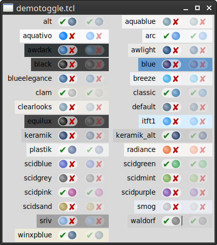
bll 2016-4-26. This code provides an alternative styling of ttk::checkbutton as a toggle switch. This style of switch is becoming more common in user interfaces. There are currently 7 different switch styles in order to support the 22 different ttk themes. The package will select a toggle switch style upon load, and a bind to <<ThemeChanged>> sets it when the theme is changed.
The user can set any of the styles as a default and can use multiple styles.
bll 2016-5-2. I have updated the package to include multiple sizes of images and depending on the tk scaling value, it changes which set of images gets displayed. No idea if I got the scaling quite right, but a quick test looks ok.
bll 2016-5-3. I forgot to mention, the package should be "required" after the tk scaling is set. I need to rearrange the initialization somehow to fix this.
Tk really needs SVG widgets.
Discussion
aspect 2016-04-28: beautiful widget and a very nice example of how to do custom layout with ttk. One question - is there any particular reason you excluded Checkbutton.focus from the layout? I much prefer having it to aid keyboard navigation & accessibility. Adding it back as a parent of the new indicator element seems to work, but I've only tested very roughly with the provided demo.
bll 2016-4-27: I copied a layout from another theme. Sorry, did not check the original. I have updated the code below to match the default ttk::checkbutton.
Code
checkButtonToggle demo code
#!/usr/bin/env tclsh

package require Tk
if { [catch {package require checkButtonToggle}] } {
  source ../../modules/checkButtonToggle/checkButtonToggle.tcl
}

proc dodisable { c } {
  variable vars

  if { $vars(disabled.$c) } {
    .cb$c state disabled
  } else {
    .cb$c state !disabled
  }
}

proc setDisplay { c } {
  set vars(onoff.$c) 0
  set vars(disabled.$c) 0

  ttk::label .l$c \
      -text $c

  ttk::checkbutton .cb$c \
      -variable vars(onoff.$c) \
      -text {} \
      -style $c.Toggle.TCheckbutton

  ttk::checkbutton .dis$c \
      -variable vars(disabled.$c) \
      -text Disable \
      -command [list dodisable $c]
  grid .l$c .cb$c .dis$c -padx 3p -pady 1p
  grid configure .l$c -sticky e
}

proc demo { } {
  variable vars

  set styles [checkButtonToggle::styles]
  set rc [checkButtonToggle::init {*}$styles]

  foreach {c} $styles {
    setDisplay $c
  }

  foreach {c} [lsort [ttk::style theme names]] {
    setDisplay $c
  }
}

demo
bll 2016-5-2: Due to the size of the package, I have made the code available for download. The checkButtonToggle package can be downloaded from:
http://gentoo.com/tcl/checkButtonToggle.tcl%|%http://gentoo.com/tcl/checkButtonToggle.tcl%|%
JOB Thank you bll for providing the source. Just like to let you know, that there is something going wrong with the images provided in the package.
Error in startup script:
compressed data after stream finalize in PNG data
while executing
image create photo -data $imgdata($dnm)
...
Running on windows with a plain ActiveState installation.
bll 2015-5-3: Let me research this. It works for me in some instances and not others. This is quite odd. It works as part of my application, but it does not work as a standalone script. I found this:
http://rkeene.org/projects/tcl/tk.fossil/info/c648c8dad1%|%http://rkeene.org/projects/tcl/tk.fossil/info/c648c8dad1%|%
And ActiveState still doesn't have 8.6.5 out.
Always requiring the Img package works (oddly enough the windows checkbuttons are in a strange display mode).
I have updated the code to require the Img package for Tcl <8.6.5.
arjen - 2016-05-03 10:44:33
I downloaded the source code and the demo works fine. Some variants look rather similar, but that may be my display.
bll 2016-5-3: I think it is how I wrote the demo code. It lists the 7 styles (variants), then displays the toggle switch that would be displayed for any themes that are loaded. Which, being standard themes, all use the same style/variant.
JOB - 2016-05-03 Downloaded again and it works flawlessly on windows. I got more adventurous and tested it on OSX too, but here the checkbutton is only a grey box. Have not investigated any further. Looks on windows very promising. Thank you very much bll.
bll 2016-5-3: Works ok on the Mac for me. It's interesting, like windows, the standard checkbuttons are in a strange display mode.