Good Looking Tk
What applications written in Tcl/Tk look really good?
More often than not, when arguing the merits of Tk with someone, I am found defending its look-and-feel more than anything. People seem turned off by the fact that Tk resembles the old Motif style. In fact, Tk can resemble most anything you want it to. It just takes a little effort. - lv perhaps one or more of the authors of these good looking tk apps could write up what the little effort involves?
FW: Tk on X looks like Motif. Tk on Mac OS 9 and Windows largely adopts the platform's native style, except a few shortcomings like the continued nonexistence of a native drop-down box widget, for which the meager menubutton is used. In general, appearance is only a "major" issue on the UNIXes.
So, with that in mind, what Tk applications do you think look really good? What applications (screenshots) would you point someone to if you wanted to dispel the myth that Tk looks like crap?
- Tcl Dev Kit -- ActiveState's Tcl toolset has put some effort into spit and polish of their Tcl tools. The docs [L1 ] have several screenshots of various tools.
- InstallBase -- http://installbase.sourceforge.net/screenshots.shtml
- snackamp -- http://snackamp.sourceforge.net
- tkdiff -- http://a.fsdn.com/con/app/proj/tkdiff/screenshots/60321.jpg
- lipsumcolor -- http://www.oklin.com/oklin2/lipsumcolor/lipsumcolor.jpg
- Oklin PAM -- http://www.oklin.com/oklin2/pam/pictures/pam_screen1_fr.jpg
- Tk_Theme -- https://web.archive.org/web/20030313184749if_/http://www.xmission.com:80/~georgeps/Tk_Theme/Tk_Theme_With_Malephiso.png
- Getleft -- http://personal1.iddeo.es/andresgarci/getleft/english/snaps.html
- pgaccess -- http://bschwarz.com/projects/pgaccess/
- RamDebugger
- moodss -- http://jfontain.free.fr/moodss/
- Alphatk -- http://www.santafe.edu/~vince/alphatk/intro.html
- tkabber [L2 ] -- a very well-done Jabber client.
- Impress -- [L3 ] - a WYSIWYG layout program that generates postscript.
- Visual Tcl -- [L4 ] - high-quality Tcl/Tk application development environment
- Browsex - https://dev.pdqi.com/fossil/browsex/doc/tip/brxshot1.jpg - Not only looks good, it works amazingly well. Tcl API allows complete control from Tcl/Tk apps
- OpenVerse -- [L5 ] - interactive chat program.
Similar page Tk widgets look fine under Windows
One of the problems here is who defines good? There are quite vocal members of the community who advocate that only if gtk is supported is an application good enough for their clients. Others call for even closer move to the Windows look and feel for their clients. The Mac OS X supports want tk to look even more like that environment. About the only way that these things are going to be achieved is if these community members begin submitting patches to Tk to provide the support that they must have.
WJR To me, good is a combination of:
- Usability (quantifiable through usability testing)
- Aesthetic appeal (harder to quantify as it's somewhat subjective)
It would certainly help (i.e. good more easily achieved) if Tk matched the native look and feel of the operating systems GUI widget toolkit, though this isn't an absolute requirement, as I've seen many well-designed Swing-based applications, Swing having it's own look and feel independent of the OS.
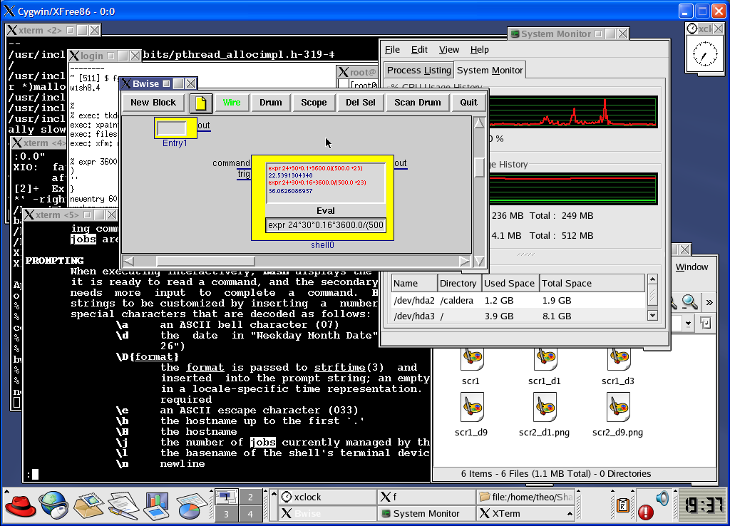
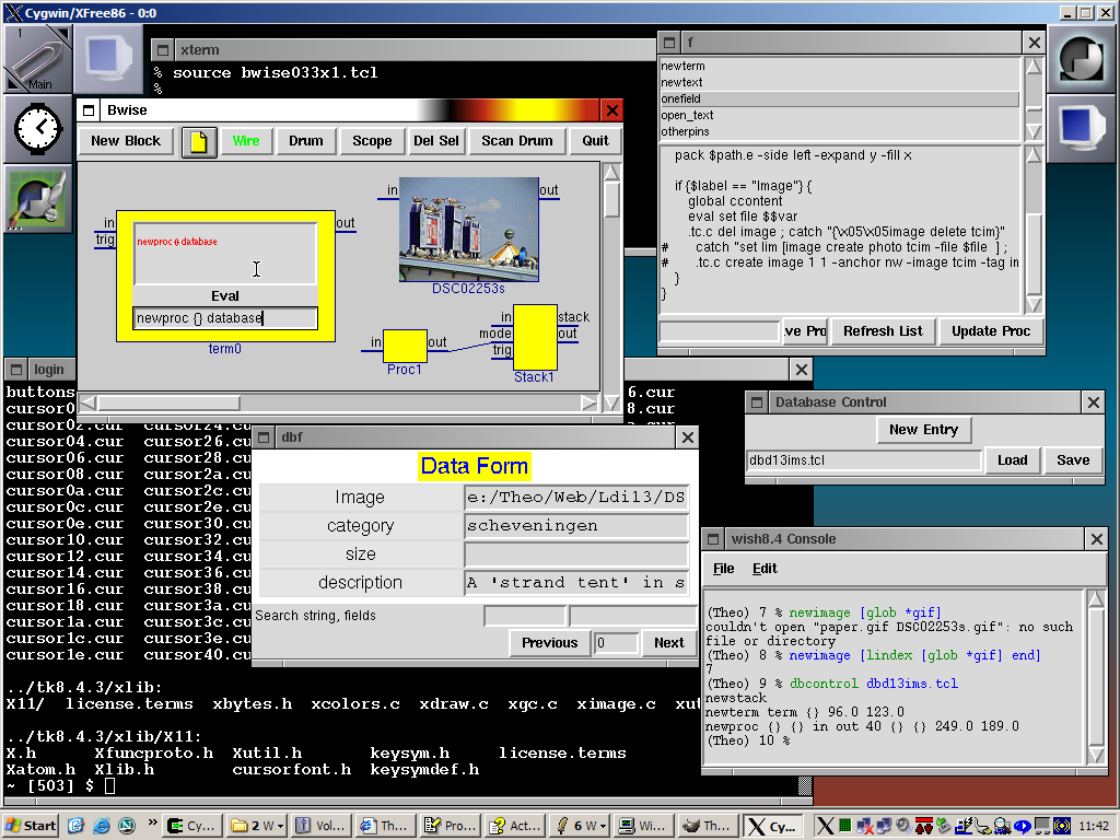
TV Tk cannot be seen seperately from its windows, for the scientifically oriented probably this looks good enough:

Bwise here runs on a XFree86 X windows simulator under windows XP, with a kde windows manager started from networked machine running linux. It 'wish8.4' runs on the windows XP machine, and has been compiled to have X windows interface. Probably even a lot better looks the wmaker NextStep feel windows manager which comes with cygwin, which also perfectly enough manages the X enabled Tk.

'(Aug 24 2003)' I added this one, where I restarted a Tcl/Tk picture database / bwise combination I did years ago on windowmaker (small NeXTSTEP simulation) running on a simulated X server on windows XP. The Bwise canvas elements don't do much work at the moment, I was experimenting with automatically scaled down pictures on it (my unix/XP tcl/tk has no 'load' yet so package require Img isn't available), which appear when one browsed the database. Of course one of these days I'll throw in a tclhttpd powered experiment, I integrated that before, too, which makes for nice application programming. The X server makes it nicer to deal with windows unders msw, for instance one can kick some terminals into place at startup, and the whole wmaker (from the cygwin distribution, which can alse compile tcl/tk) environment can also be started by a single command.
WJR TV I don't understand what these screenshots and narrative tell us about the aesthetic appeal (or lack thereof) of TK.
'For me they illustrate that Tk looks rather clunky. The screenshots don't seem like particularly good examples of "Good Looking Tk"
This discussion was started at c.l.t. because of an article [L6 ] at Freshmeat.
Apparently the recently concluded Tcl'2003 conference had much discussion on this topic. Read the related wiki pages for details.
EKB 27 April 2005 -- Looking at the comments from the conference, I was struck by the (true) comment that it's so easy to make a GUI in Tcl/Tk that many people end up making bad ones. The same is true for HTML, it's so easy to make a web page that many people end up making bad ones. But there are lots of books to help people make decent HTML sites, because designers end up face to face with web sites that programmers have released into the wild and they have risen to the challenge.
It seems to me that an interface design book/site aimed specifically at Tcl/Tk could be useful. What guidelines should people follow? What's been seen to work? There are some good books on UI design, but none that I know of that get you past typing
pack .myBeautifulWidget ...
or tell you if you would be better off using grid or place instead.
LV I agree. Not only is it easy to make bad looking GUIs, it is tough to design and implement GUIs that work well. By that I mean that don't have annoying extra dialogs, or make bad assumptions without a means for the user to set to something better, etc.
EKB 29 April 2005 -- In hopes it might be useful for making good-looking Tcl, I'm going to start a page on User Interface Design for Tcl/Tk. Please add to it!
bsb - 2009-10-15 03:58:58
gitk looking less ugly with tk8.5, see: http://navarra.ca/?p=44
dzach - 2009-10-19 Thanks! git gui will also look better if one changes wish8.4 to wish8.5, around line 10 in /usr/bin/git-gui, assuming wish8.5 is installed.